Couples Budgeting 101: The Automated Way to Track Your Money

Updated: Aug 1
Introduction
Managing finances as a couple often means choosing between clunky, outdated spreadsheets and expensive monthly apps. Trying to track shared bills while keeping your own "guilt-free" spending separate can quickly turn into a headache.
Enter the Couples Budget Planner.

Designed to bring total harmony to your household, this tool delivers a premium, app-like experience right inside Microsoft Excel. It is built to help you manage your shared life without losing your financial independence.
With fully automated dashboards, debt tracking, and built-in 50/30/20 goals, there is no complex math required. You simply log your daily spending and let the planner do the rest.
Ready to take control of your financial future? Let’s take a look at how this financial command center works, sheet by sheet.
Quick Start: Your Setup Page
Welcome to the control center of your planner! Fill this out first to automate your entire budget spreadsheet.
1. The Basics
Enter your partner names, currency symbol and starting month at the top. ✨ Magic touch: This automatically updates your main dashboard and all monthly tabs!
2. Custom Categories
Tailor the planner to your life by splitting your expenses into two buckets:
Shared Expenses: Joint household costs (rent, utilities, groceries).
Personal Spends: Your individual daily expenses.

3. Assign Your Tasks
For every expense category you create, assign two tags from the dropdown menus:
The 50/30/20 Tag: Choose Need (essentials) or Want (lifestyle). This powers your 50/30/20 dashboard.
The Payment Type:
Choose Fixed Bill for recurring, static costs. (Note: These will automatically sync to your Bills & Subscriptions sheet!)
Choose Variable for day-to-day costs that fluctuate.
4. Automated Savings Hub
Scroll down to the Savings section—and skip typing! This area is completely automated. You will manage your actual goals in the dedicated Savings Goals tab, and your progress will seamlessly auto-populate right here.

The Running Total Sheet
The Running Total sheet is the ultimate bird’s-eye view of your financial health. Instead of getting bogged down in daily transactions, this page zooms out to show you exactly how your wealth is growing over the entire year.
How to Enter Values (Spoiler: You Don't!)
The best part about the Running Total sheet is that it is 100% automated. You do not need to type a single number into this page!
Every time you log an expense, check off a bill, or record a paycheck in your monthly tabs (January, February, etc.), this sheet instantly pulls that data and updates your yearly totals. Sit back and let the planner do the heavy lifting.
The Top Dashboard: Your KPIs Explained

YTD Total Income: Your "Year-To-Date" earnings. This is every dollar you and your partner have brought in so far this year.
YTD Total Spent: The exact amount of money that has left your accounts across all categories.
YTD Net Surplus: Your total income minus your total spent. This is the actual cash you have retained—your true wealth growth!
Best Month / Worst Month: The planner automatically scans your year and highlights the months with your highest and lowest net cash flow, showing exactly how much you retained (or overspent) in those months.
Avg Monthly Savings: The average amount of money you are successfully stashing away each month for your saving goals.
50/30/20 Breakdown: These pie charts provide a quick health check on your yearly spending balance. The percentages display exactly how much of your actual total income (strictly new income, excluding any past month rollovers) went toward your Needs, Wants, and Savings. The accompanying numbers track your exact Year-To-Date dollar totals for each category.
YTD Total Saved: The cumulative dollar amount of all your savings contributions so far this year.
Total Bills Paid: A running tally of how many fixed bills you have successfully cleared.
Avg Saved from Income: The average portion of your total income that is being retained rather than spent.
Avg Monthly Spending: Your average monthly "burn rate" (how much it costs to fund your lifestyle each month).
The 50/30/20 Dashboard: Deep Dive into Your Monthly Habits
While the Running Total sheet gives you a zoomed-out view of your year, the 50/30/20 Dashboard is designed to put a magnifying glass over a single month. This page analyzes exactly how well you are balancing your Needs, Wants, and Savings according to the popular 50/30/20 budgeting rule.
1. The Crucial First Step: Select Your Month
Because this is a dynamic dashboard, it will appear blank or show old data until you tell it
what to look at!

To get started, look for the dropdown menu at the top of the page. Simply click the arrow and select the specific month you want to review. The entire dashboard will instantly update to reflect that month's financial data.
2. The Monthly Snapshot (Top KPIs)

At the very top of your dashboard, you will see four quick-glance metrics that summarize your selected month:
Total Income This Month: The exact amount of money you brought in during this specific month.
Total Spent This Month: Every dollar that left your accounts across all categories.
Net Cash Flow: Your income minus your expenses. If this is positive, you had a surplus!
Budget Used %: A quick percentage showing how much of your total income you have already spent.
3. The 50/30/20 Breakdown Panels

This is the core of the dashboard. It splits your finances into three distinct buckets: Needs (Target 50%), Wants (Target 30%), and Savings (Target 20%).
For each bucket, the dashboard calculates:
Target Amount: Based on your total income for the month, this is the exact dollar amount you should be aiming for to perfectly hit your 50/30/20 goals.
Actual Spent: How much you actually spent (or saved) in this category.
Actual %: What percentage of your income this category actually consumed.
Over / Under: The exact dollar amount you went over (or stayed under) your target budget.
Status: A handy status that visually confirms if you successfully stayed on target!
4. Your Top Spending Categories

At the bottom of the dashboard is an automated, sorted list of your expenses for the month. This section strips away the guesswork by showing you exactly where your money went, ranked from highest to lowest.
Category & Tag: Identifies the specific expense (e.g., Rent, Groceries, Shopping) and reminds you how you classified it (Need, Want, or Savings) during your initial setup.
Spent: The total dollar amount dropped into that category for the month.
% of Income: Both a visual progress bar and a precise percentage showing exactly how much of your monthly income was eaten up by that single category.
The Saving Goals Sheet: Mapping Your Future
The Saving Goals tab is where your financial planning gets exciting. Whether you are building an emergency fund, planning a vacation, or saving for a downpayment, this sheet automatically tracks your progress and tells you exactly when you will hit your targets.
Here is how to navigate and use this page effectively.
1. The KPI Dashboard (Your Progress at a Glance)

At the very top, a comprehensive dashboard summarizes your entire savings journey:
Total Saved Across all Goals: The absolute dollar amount you have successfully stashed away across every single goal.
Total Target Amount: The combined finish line—how much money you need to fully fund all your active goals.
Overall % Towards Goals: A visual progress bar and percentage showing how close you are to funding everything combined.
Goals on Track: A quick count of how many goals are mathematically on pace to finish by their target dates.
Active / Completed Goals: A tally of how many goals you are currently working on versus how many you have successfully finished.
Average Monthly Needed & Total Monthly Contribution: Shows you exactly how much cash you need to allocate each month to stay on track, compared to what you are currently planning to contribute.
Shared & Individual Totals (Shared, Partner A, Partner B): A breakdown of exactly how much money is sitting in the shared household goals versus each partner’s individual goals.
Individual Share: A color-coded visual bar chart showing the ratio of who holds what portion of the total saved funds.
2. Setting Up Your Goals (The White Cells)
To keep the sheet clean and prevent the automated formulas from breaking, you only ever need to type in the white cells. Everything else (the light green/colored cells, progress bars and projections) is calculated for you.
For each new goal, simply fill in:
Goal Name: What are you saving for? (e.g., New Emergency Fund)
Target Amount: The total cost of the goal.
Target Date: The exact date you want to have this fully funded by.
Planned Monthly Contribution: How much you intend to put toward this specific goal every month.
Once these white cells are filled, the sheet will automatically calculate your Amount Still Needed, your Projected Finish Date, your Months Remaining, and generate a beautiful visual progress bar!
3. Short-Term vs. Long-Term Tracking
To keep your goals incredibly organized, each section (Shared, Partner A, and Partner B) provides space for 10 total goals—specifically broken down into 5 Short-Term Goals and 5 Long-Term Goals.
Because these two types of goals behave differently in real life, they are tracked differently in your planner:
Short-Term Goals (Automated): For your 5 short-term slots, the "Current Saved" column is 100% automated. As you log your savings contributions in your individual monthly tabs (January, February, etc.), this sheet automatically pulls those numbers in and updates your current balance.
Long-Term Goals (Manual): For your 5 long-term slots, you are in the driver's seat. Because long-term goals (like a multi-year house fund) often live in separate high-yield accounts and don't cleanly align with standard monthly cash flow, you will manually type your updated balance into the "Current Saved" column whenever you want to update your progress.
The Debt Tracker: Your Roadmap to Financial Freedom
While the rest of your planner tracks your daily and monthly cash flow, paying off debt is a marathon, not a sprint. Because debt spans over multiple years, the Debt Tracker is a standalone sheet. It is intentionally not connected to your monthly tracking tabs. This keeps your daily budget clean while giving you a dedicated command center specifically designed to crush your long-term debt!
Here is how to use the Debt Tracker to build your payoff strategy.
1. The Debt Dashboard (Your KPIs Explained)
At the top of the sheet, you will find a comprehensive dashboard that calculates your overall debt-free journey. These Key Performance Indicators (KPIs) update automatically as you log your payments:

Total Debt Remaining & Total Debt Paid So Far: The exact principal balance you still owe, compared to the hard work you have already put in.
Final Debt-Free Date: The most exciting metric! Based on your current payment plan, this projects the estimated month and year you will be 100% debt-free.
Total Interest & Total You'll Pay: A reality check showing exactly how much interest will accumulate, plus the true total cost of the loans.
Strategic Targets (Snowball vs. Avalanche): The dashboard automatically identifies your Smallest Balance Debt (for those who prefer the Snowball method for quick mental wins) and your Highest Interest Rate Debt (for the Avalanche method to save the most money).
Progress Bar: A visual three-part bar showing your "Already Paid" amount, "Principal Left," and the "Interest Amount" still looming.
2. Setting Up Your Debts (The White Cells)
Getting started is simple. Look at the upper table and only fill in the white cells. The colored cells are locked with formulas to do the heavy lifting for you!

For every new loan or credit card, enter the following:
Debt Name & Debt Type: What is the loan, and what category does it fall under (e.g., Car Loan, Credit Card).
Starting Balance: The total amount you owed when you started using this planner.
Interest Rate: The APR applied to the loan.
Min. Monthly Payment: The absolute minimum you are required to pay the bank each month.
Extra Target Payment: The secret weapon! Any extra cash you plan to throw at this specific debt each month to accelerate your payoff date.
Once you enter these details, the planner instantly calculates your projected payoff date, total interest, and generates a visual progress bar for that specific loan!
3. Logging Your Monthly Payments (The Lower Table)
Below your setup table is your Payment Log. This is where you will record every single payment you make toward your debts over the years.

Whenever you make a payment, simply scroll to this bottom section and log:
Debt Name & Debt Type: Select the debt you just paid.
Date of Payment: When the transaction cleared.
Payment Method: Where the money came from (e.g., Personal Account, Joint Account).
Amount: The exact dollar amount you paid.
Notes / Description: Any helpful details (e.g., "Extra principal payment from work bonus!").
Because this list is completely manual and isolated from your monthly cash flow sheets, you can track years of debt payments in one continuous, organized ledger without ever disrupting your current monthly budget. Just log the payment, watch your "Total Debt Remaining" drop, and celebrate getting one step closer to financial freedom!
How this works?
1. The Manual Inputs (What the User Types)
These are the static numbers the user provides to set up the calculation:
Starting Balance: $18,000.00 (The total amount owed when they start using the planner).
Interest Rate: 12.00% (The annual interest rate of the loan).
Min. Monthly Payment: $350.00 (The mandatory payment).
Extra Target Payment: $100.00 (Any extra cash they are putting toward the principal).
2. The Automated Calculations (The Excel Magic)
Once the setup is done, the sheet takes over. Here is the exact math happening behind the scenes for the Car Loan:
Total Paid YTD (Year-To-Date): $2,750.00
How it works: The sheet automatically adds up every payment the user has logged in the lower transaction table for the "Car Loan".
Current Balance: $15,250.00
The Math: Starting Balance minus Total Paid YTD ($18,000 - $2,750 = $15,250). This shows exactly what is left to pay.
Monthly Amt: $450.00
The Math: Min. Monthly Payment plus Extra Target Payment ($350 + $100 = $450). This is their true monthly firepower against the debt.
Months Left: 42
How it works: The sheet uses a complex financial formula (the NPER function in Excel) to calculate exactly how many months it will take to pay off a $15,250 balance at 12% interest if they pay exactly $450 a month.
Payoff Date: Jan 2030
How it works: The sheet simply takes today's date, adds 42 months to it, and gives them the exact month and year you will pop the champagne!
Total Interest: $3,650.00
The Math: (Months Left × Monthly Amt) - Current Balance.
(42 months × $450) = $18,900 in total future payments.
$18,900 - $15,250 (the principal) = $3,650 lost to interest.
% Paid Off: 15.28%
The Math: Total Paid YTD divided by the Starting Balance ($2,750 / $18,000 = 0.15277, which rounds to 15.28%).
The Bills & Subscription Tracker: Never Miss a Due Date
We all have fixed expenses that hit our accounts on a regular schedule—rent, utilities, insurance, and those sneaky streaming subscriptions. The Bills & Subscription sheet is your automated safety net designed to keep you organized, prevent late fees, and help you audit exactly what you are paying for.
The best part? This sheet works in tandem with your monthly tracking tabs to provide a fully automated checklist!
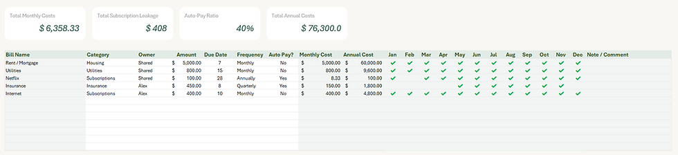
1. The Subscription Dashboard (Your KPIs)
At the top of the page, four powerful metrics give you an instant snapshot of your fixed lifestyle costs:
Total Monthly Costs: The exact amount of money you need to have in your account each month just to cover your baseline bills and subscriptions.
Total Subscription Leakage: This is a fantastic metric for cutting back! It isolates the total monthly cost of items categorized purely as "Subscriptions" so you can see exactly how much money is leaking out to streaming services, software, and memberships.
Auto-Pay Ratio: Shows the percentage of your bills that are set to autopay. The closer to 100%, the less manual work you have to do each month!
Total Annual Costs: A reality check that multiplies your monthly fixed costs over the whole year, helping you see the long-term impact of your fixed bills.
2. Setting Up Your Recurring Bills
To populate your list, simply fill out the basic details for each recurring expense:
Bill Name & Category: What the bill is and how it is categorized (Housing, Utilities, Subscriptions).
Owner: Perfect for couples! Note whether this is a "Shared" household bill, or if it belongs specifically to one partner (e.g., Alex or Taylor).
Amount, Due Date & Frequency: Enter the standard cost, the day of the month it is due, and how often it hits (Monthly, Quarterly, Annually).
Auto Pay?: A simple Yes/No dropdown.
Once you enter the Amount and Frequency, the sheet's built-in formulas will automatically calculate both the exact Monthly Cost and the true Annual Cost for you!
3. The Automated Payment Checklist (Jan - Dec)
This is where the automation shines. You do not need to manually check off boxes on this page!
Because this planner is fully interconnected, the payment statuses are pulled directly from your monthly tabs. As you go about your normal routine—logging your daily expenses in the January, February, or March sheets—this dashboard is working in the background. The moment you log a fixed bill as paid in your monthly tab, a beautiful green checkmark (✔️) will automatically appear under the corresponding month on this tracker.
If a bill is quarterly or annual (like the Netflix or Insurance examples), the checkmarks will only appear in the specific months those bills are actually due. It gives you a perfect, effortless visual confirmation that your life is fully funded and on track!
The 12 Monthly Sheets: Your Daily Financial Diary
While the master dashboards give you a zoomed-out view of your year, the 12 Monthly Sheets (January through December) are the daily drivers of your budget planner. This is where the magic happens. You log your day-to-day spending here, and the sheet instantly translates that data into beautiful, actionable insights.
Here is everything you need to know about navigating and filling out your monthly tabs.
1. The Monthly Dashboard & KPIs
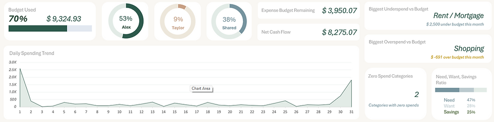
At the top of every monthly sheet, you are greeted with a mini dashboard that tracks your performance for that specific month in real-time.
Budget Used & Net Cash Flow: Instantly see what percentage of your total budget you have burned through, how much cash you have left, and your net cash flow for the month.
The Spender Breakdown Rings: Three visual rings show exactly who is spending what, broken down by percentage (e.g., Partner A, Partner B, and Shared).
Daily Spending Trend: A sleek line chart that spikes on the days you spend the most, helping you identify if weekends or specific dates are your budget weak points.
Biggest Overspend & Underspend: The sheet automatically flags the specific category where you saved the most money, and the category where you went over budget (e.g., catching that you went over on "Shopping").
Need, Want, Savings Ratio: This mini-tracker shows you exactly how your "spending pie" is sliced. If you spent $5,000 this month, this tracker doesn't look at your income; it simply tells you how that $5,000 was divided up (for example, 47% of the money you spent went to Needs, 28% to Wants, and 25% to Savings). It is a fantastic way to audit your immediate spending habits and see exactly where your cash flow is going on a day-to-day basis!
2. The Three-Way Budget Split (Personal vs. Shared)
Just below the KPIs, you will see your master budget table. This planner is uniquely designed for couples, meaning it doesn't just lump all your money together!

The categories are cleanly divided into three main columns:
Partner A (e.g., Alex)
Partner B (e.g., Taylor)
Shared Expenses
For each of these three columns, you have a Budget, Actual, and Variance section. This allows you to set a joint budget for shared groceries, while keeping completely separate personal budgets for things like individual hobbies or personal dining. The sheet then adds it all together in the "Combined Total" column to ensure the household as a whole is staying on track.
3. Logging Your Expenses (The White Cells)
So, how do you get all those beautiful charts and dashboards to update? By filling out the transaction tracker!

As shown in the image, the expense tracker is incredibly straightforward. To protect the automation formulas, you only ever need to type in the white cells.
Whenever you make a purchase, simply enter:
Date: The day the transaction occurred.
Spender: This is the most important step for couples! Use the dropdown to select if this was Partner A (Alex), Partner B (Taylor), or a Shared expense. This single click is what tells the dashboard to split your costs into those three distinct columns above!
Category: Select where the money went (e.g., Groceries, Rent, Entertainment) from your pre-set dropdown list.
Amount: The exact dollar amount spent.
Notes: An optional space for extra details (e.g., "Target run" or "Date night").
That's it! Once you fill in a row on the transaction log, every single KPI, chart, and dashboard across the entire workbook updates automatically.
The Master Annual Dashboard: Your Financial Command Center
If the monthly tabs are your daily diary, the Master Annual Dashboard is your ultimate financial command center.
The best part about this sheet? You don't have to type a single number here.
Every single KPI, chart, and progress bar on this page is 100% automated. It pulls data from your setup page, your monthly logs, your debt tracker, and your savings goals to give you a beautiful, app-style overview of your entire financial year.
Here is a breakdown of the powerful insights waiting for you on this dashboard:
1. The Quick-Glance KPIs (The Top Panels)

At the very top of the dashboard, ten vital metric cards give you an instant read on your financial health. These include:
YTD Total Income & YTD Total Expense: Your complete "Year-To-Date" cash flow summary.
Avg Monthly Net Amount: Your true average surplus—the average amount of money you retain each month after all bills are paid.
Total Debt & Debt Free Date: A constant, motivating reminder of your remaining balance and your automated payoff date.
Total Saved & Goals on Track: See your total cash reserves and exactly how many of your custom savings goals are pacing correctly.
Best vs. Worst Month: The planner automatically identifies your highest net month and your lowest net month, helping you spot seasonal spending trends.
The Annual Ratio: A snapshot of your overall Need / Want / Savings ratio for the entire year.
2. Deep-Dive Analytics (The Side Panels)

On the right side of the dashboard, the planner breaks down your specific household dynamics:
% of Savings Goals Achieved: A stunning circular progress ring and bar chart showing your completed goals versus the exact dollar amount still required.
Individual Average Monthly Income: Perfect for couples! This bar chart visually compares Partner A's average income to Partner B's, giving you a clear picture of who brings in what.
Top 6 Average Monthly Expenses: Stop wondering where your money went. The planner automatically ranks your top six highest expense categories, so you know exactly where to cut back.
3. Beautiful Data Visualization (The Core Charts)


Forget boring spreadsheet grids. The Annual Dashboard features three massive, premium charts designed to help you visualize your wealth building over time:
Cumulative Net (Year Progress): This diagonal line chart tracks your YTD Net Surplus from January to December. Watching this line climb up and to the right is the ultimate motivation!
Monthly Income vs Spending: A side-by-side bar chart for every month of the year. Instantly see if your dark green "Income" bar is safely hovering above your light gray "Spending" bar.
12-Month Net Trend: A dynamic area chart that tracks the peaks and valleys of your monthly cash flow. It makes it incredibly easy to see if your financial habits are trending in the right direction as the year progresses.
Conclusion: Build Your Financial Future Together
Achieving financial freedom as a couple doesn't have to be a source of stress or require hours of tedious math. With the right system in place, budgeting becomes a seamless, automated part of your routine—giving you both the clarity and confidence to build the life you want.
The Couples Budget Planner takes the heavy lifting out of managing your money. By handling the complex calculations, tracking your debt payoffs, and organizing your savings goals automatically, it frees you up to focus on what really matters: hitting those milestones together.
Ready to transform your household finances? You can grab your copy of the planner and start your journey today!
Did you find this breakdown helpful? Please give this post a like and share it with anyone who might find it useful! I would also love to hear from you—drop a comment below and let me know: What is the biggest budgeting challenge you face as a household right now?


Comments